
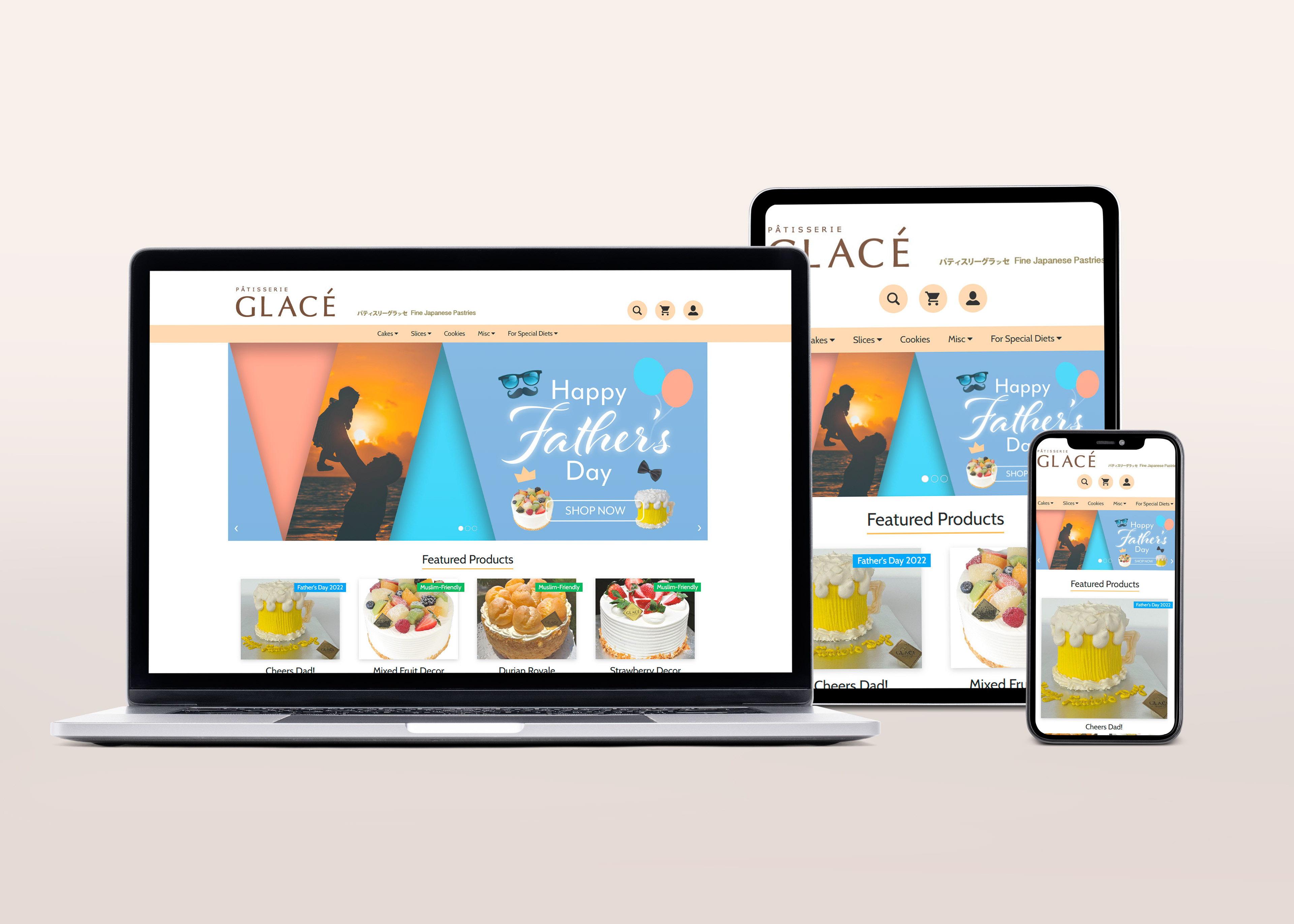
For this school project, we were tasked to revamp a website for a local pastries shop. One of the requirements of the project is to ensure that the design is responsive to the screen size it is viewed on.
Learning how to make a website responsive has put our problem-solving skills to the test as it was our first time creating a website from scratch using HTML and CSS.
We designed a prototype in Miro and ensured the design language is consistent throughout the individual pages.
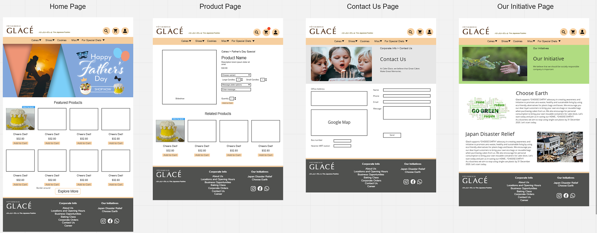
Design prototype in Miro

Full page design